Capital One
The Customer Protection rebrand balances flexibility and consistency, enabling individual teams to maintain their identity while working within a clear, unified internal visual system.
Branding
Objectives
Capital One partnered with Altas to create a cohesive system of internal team logos across multiple departments within their Fraud Prevention and Investigations organization.
This work was not about external marketing. It was about internal identity. Teams needed visual marks that created personality, pride, and unity while still aligning with strict brand standards and enterprise governance. Each logo had to feel distinct enough to represent how the team operates, yet consistent enough to live comfortably within one of the largest financial institutions in the U.S.
Above all, the logos needed to be something employees were proud to wear, share, and put on merchandise, all while staying fully within approved brand guidelines.
Solutions
Altas collaborated closely with multiple internal teams to design a suite of logos built on Capital One–approved foundations. All marks were developed using the bank’s sanctioned color system and the Optimist typeface to ensure full brand compliance. From there, each logo was thoughtfully shaped to reflect the team’s function, culture, and role within the broader fraud ecosystem, while avoiding any exposure of sensitive workflows or internal processes.
Team Identity Highlights
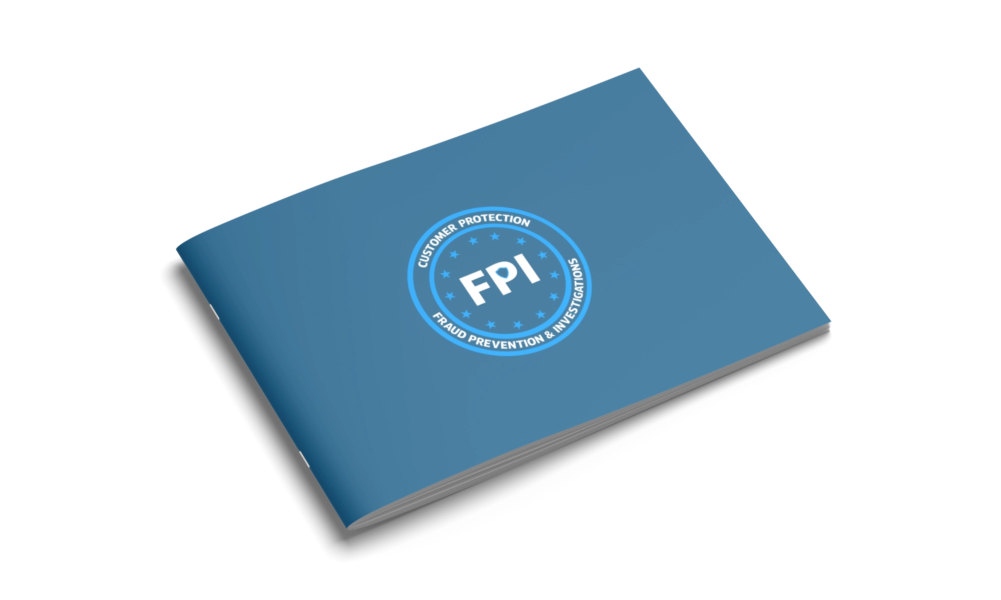
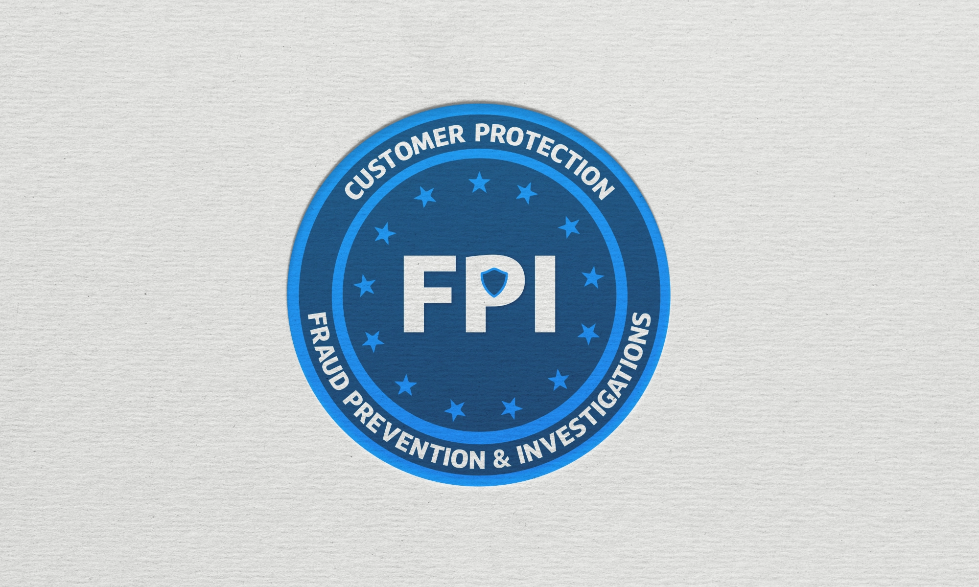
Fraud Prevention and Investigations (FPI)
As the umbrella security organization representing more than 500 employees, FPI’s logo draws from a familiar federal-style aesthetic. The design signals precision, vigilance, and responsibility, reinforcing the group’s role in protecting customers and the institution at scale.
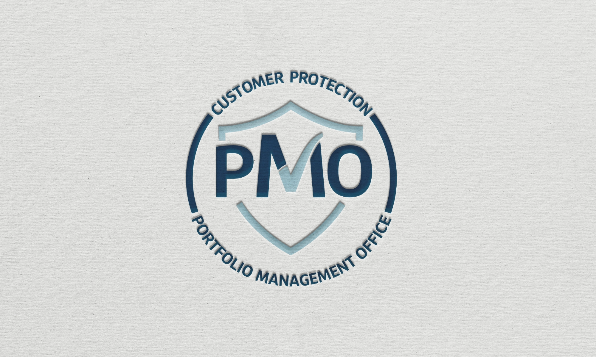
Portfolio Management Operations (PMO)
Operating within FPI, PMO’s logo extends the shield motif and pairs it with a checkmark to represent execution, progress, and follow-through across complex portfolios and workflows.
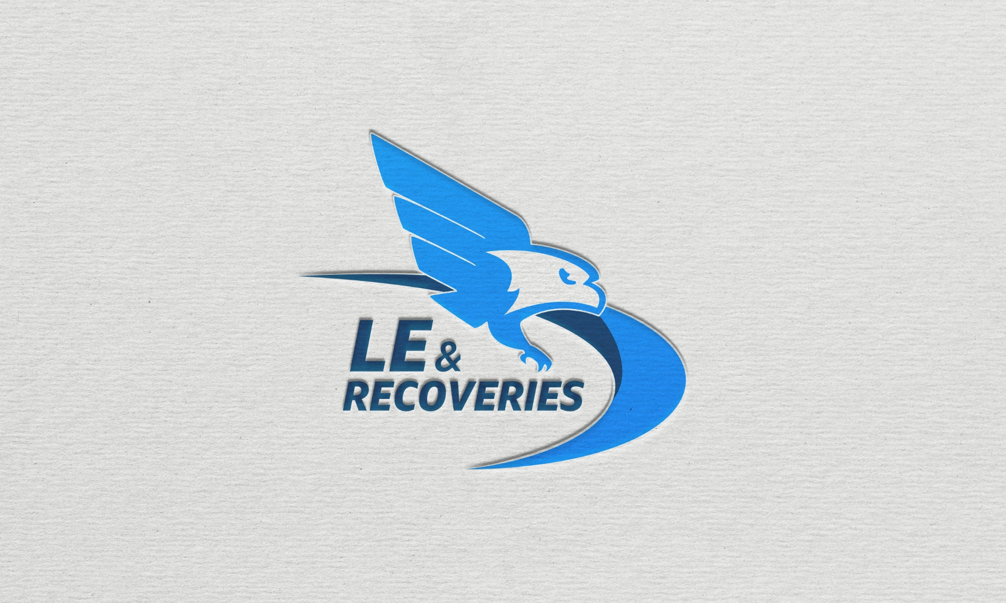
Law Enforcement and Recoveries (LER)
Focused on law enforcement partnerships and recovery efforts, LER’s mark features an eagle icon as a symbol of justice, authority, and follow-through. The design communicates confidence and accountability without overstatement.
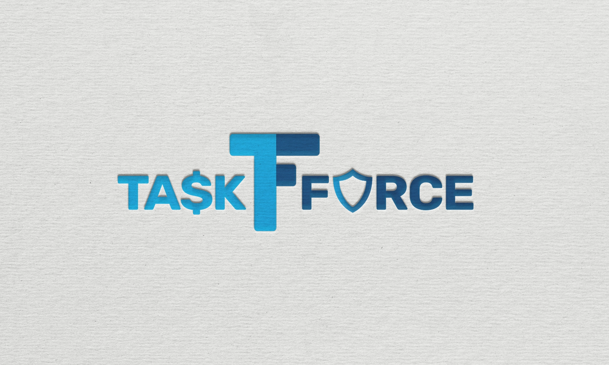
Task Force (TF)
A backend operational team responsible for critical reporting and financial movement across investigation stages. The Task Force logo was designed to feel tactical, adaptable, and utilitarian, reflecting the behind-the-scenes nature of their work.
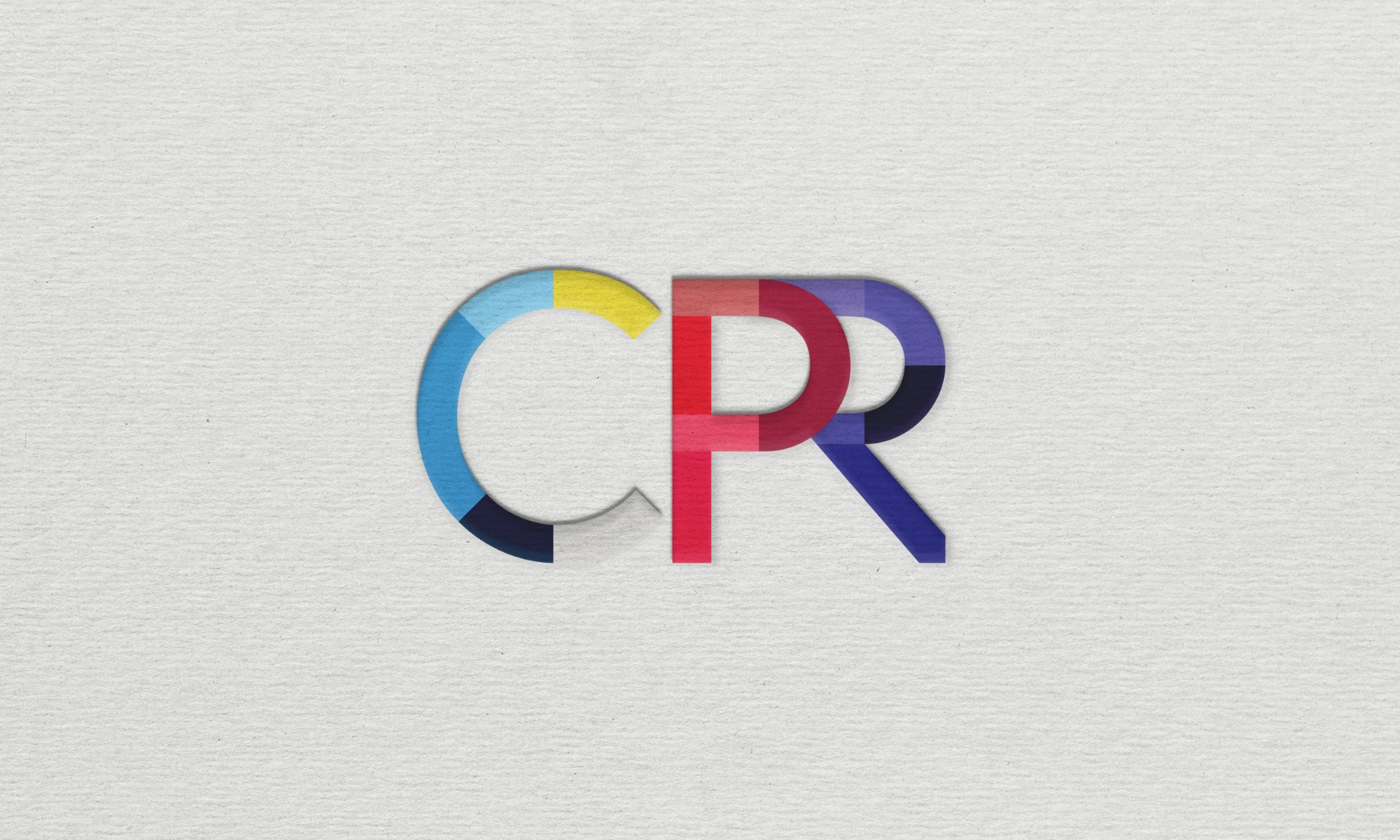
Customer Protection Resolution (CPR)
A customer-facing team with a wide range of backgrounds and personalities, CPR’s logo uses layered color variation to reflect empathy, individuality, and collaboration. The approach supports a fast-paced call center environment while still feeling cohesive and intentional.
Results
The final logo system delivered Capital One a cohesive, brand-safe identity suite that gave each team its own voice without compromising enterprise consistency.
Teams now have visual identities they’re proud to put on internal materials, presentations, and merchandise — strengthening morale, recognition, and team culture across departments. At the same time, leadership gained a scalable framework for future team branding that remains fully aligned with Capital One’s visual standards.